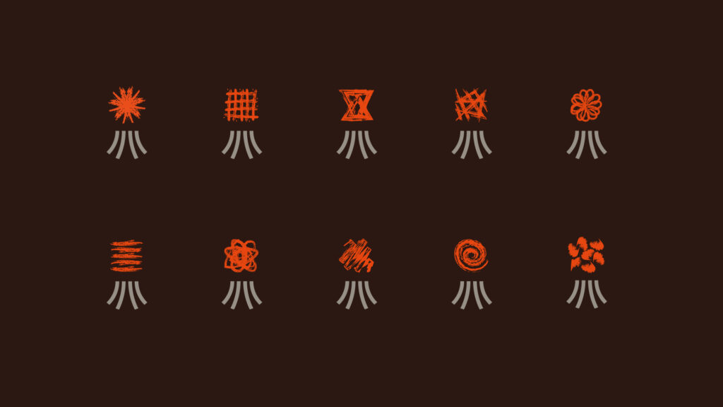
Icon set for a bar: cocktail icons and labels

Client:
Bar
Sector:
Bar and drink
Year:
2019
Services:
Icon design, label packaging
Context
A city bar aimed at a young, dynamic audience wanted to promote a new offer dedicated to “to walk” cocktails, designed for informal, quick consumption. The goal was to make the offer clearer and more recognisable, including outside the venue.
Solution
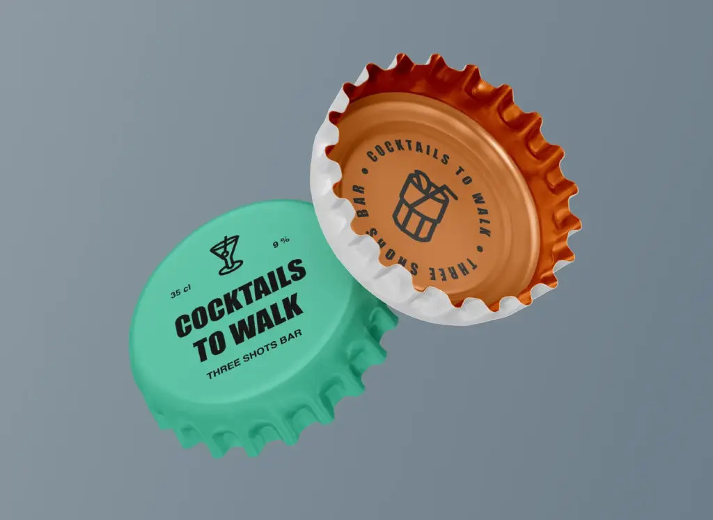
I developed a series of original icons to represent, at a glance, the different types of drink on the menu. The simple shapes and uniform stroke weights suit both digital and printed materials, improving the legibility and visual consistency of the communication.
Outcome
A fresh, direct visual language that strengthens the venue's identity and makes the offer more appealing, easing the customer's choice and improving the overall experience.
Increased recognisability. The audience (young people) correctly recognised and chose the bar, helping to build a more authentic brand identity in the local area.
Higher social media engagement. More interactions and user-generated content during the campaign, with growth in the venue's community.
The option of using the caps for games and gamification increased interest, encouraged loyalty and brought new customers to the bar.