Lineo: naming and logo for a wood brand

Client:
Lineo
Sector:
Wood and interior design
Year:
2022
Services:
Visual identity, logo design, brand guidelines, web landing-page, social media
Context
In an interior design market increasingly focused on sustainability, LINEO was founded as a studio dedicated to transforming wood into modular objects and spaces.
The challenge was to develop an identity that conveys respect for the environment, innovation, and continuity with artisanal traditions, while distinguishing the brand within the sustainable architecture and design industry.
Solution
The naming combines three levels of meaning: “legno” (wood) as the raw material, “Linnaeus” as a symbol of classification and knowledge, and the suffix “-neo” as a reference to novelty and evolution.
The payoff “New lifeblood for wood” reinforces this vision of regeneration and innovation.
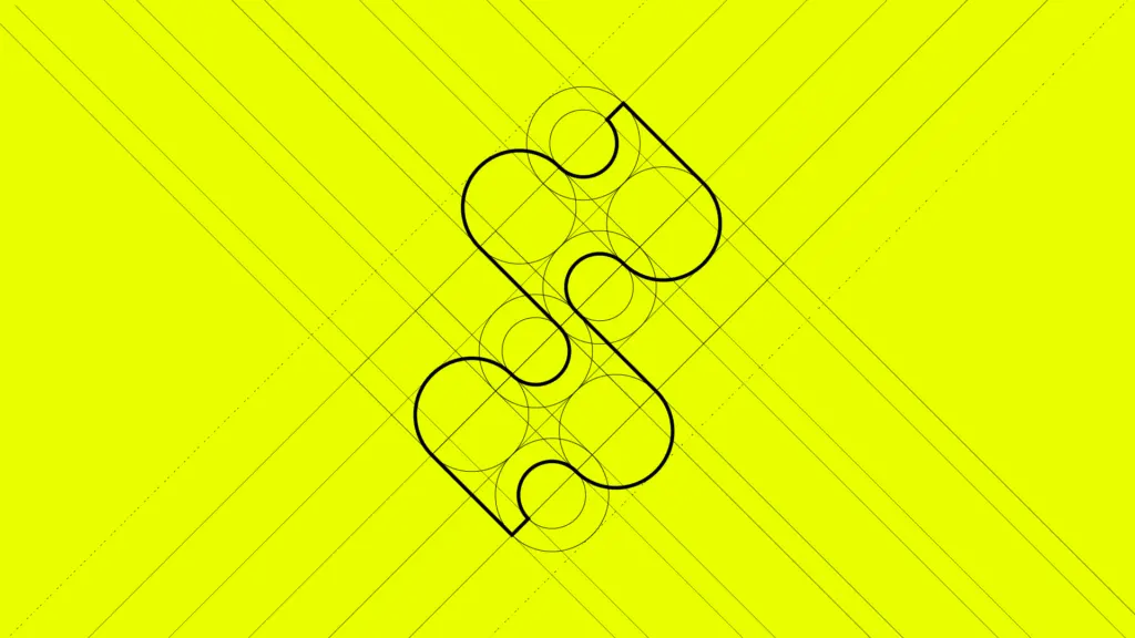
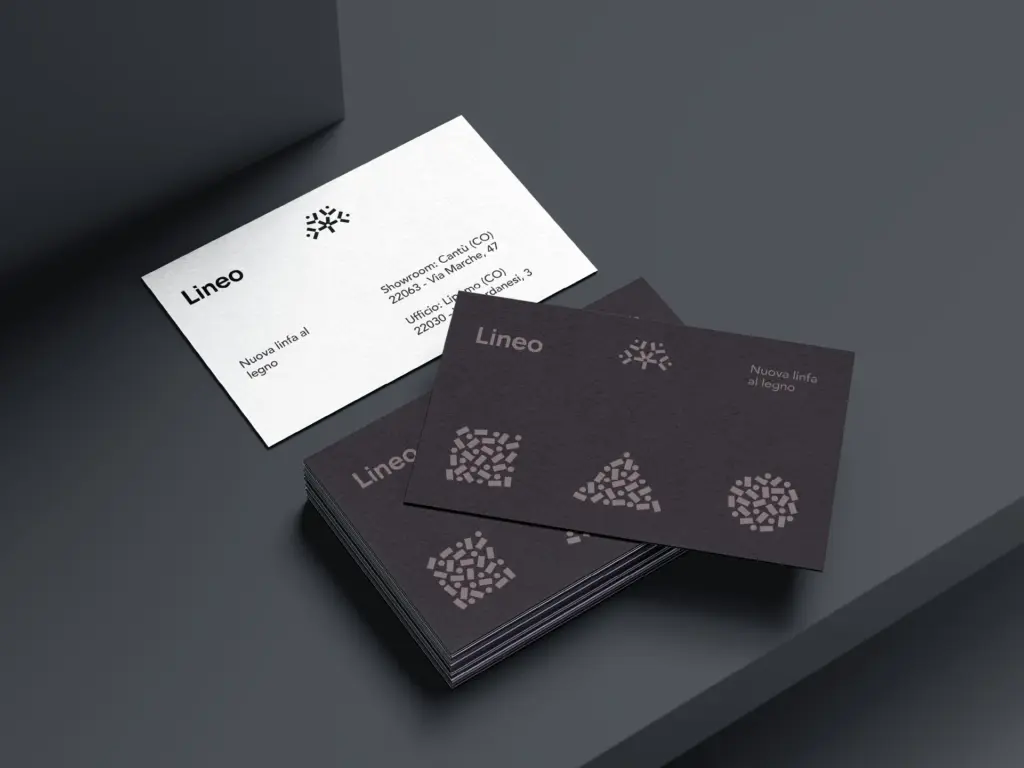
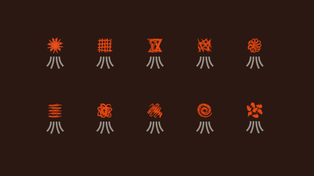
The logo is built from simple geometric elements, rectangles and circles arranged in a radial pattern that evokes the crown of a tree.
These basic shapes suggest modularity and construction, while the radial symmetry conveys balance, growth, and regeneration.
Outcome
LINEO stands out with a strong and distinctive identity that communicates wood transformation as a sustainable and innovative process. The brand conveys balance and respect for nature, strengthening the studio’s credibility in the eyes of clients and partners.
Rafforzamento dell’autorevolezza del brand sul mercato, testimoniato da una maggiore fiducia e coinvolgimento da parte dei clienti.
Aumento delle richieste di contatto e sopralluogo, con un +40% nei sei mesi successivi alla nuova strategia di comunicazione.
Maggiore capacità di posizionamento sul segmento alto di mercato, che ha permesso di giustificare un aumento medio dei prezzi.